
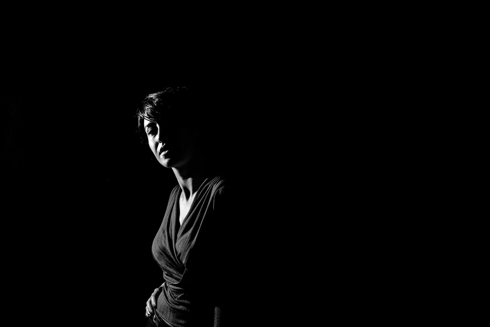
Chiaroscuro is often introduced as a method for making a painted figure appear three-dimensional, but that definition is too modest for the experience it creates. Light and shade do not simply describe the body. They establish a threshold between what can be approached and what must remain uncertain, between visible fact and emotional suggestion. In a successful high-contrast composition, darkness behaves almost like a wall, curtain, or deep recess. It controls how near the viewer feels to the scene, how quickly the eye moves, and how much psychological pressure gathers around a gesture. For artists, designers, and filmmakers, this makes chiaroscuro a spatial instrument as much as a rendering technique.
Light, in this sense, does not merely expose an image. It cuts into it. A narrow beam can give a hand the authority of an architectural column, while a swallowed background can make a room feel smaller than its physical dimensions. This principle remains useful wherever atmosphere and function must coexist, from a carefully composed chiaroscuro study to a contemporary interior or film frame. Caravaggio and Artemisia Gentileschi understood this power with particular force. They did not treat darkness as leftover space surrounding the subject. They weaponized it, using shadow to conceal, compress, isolate, and then release emotional information.
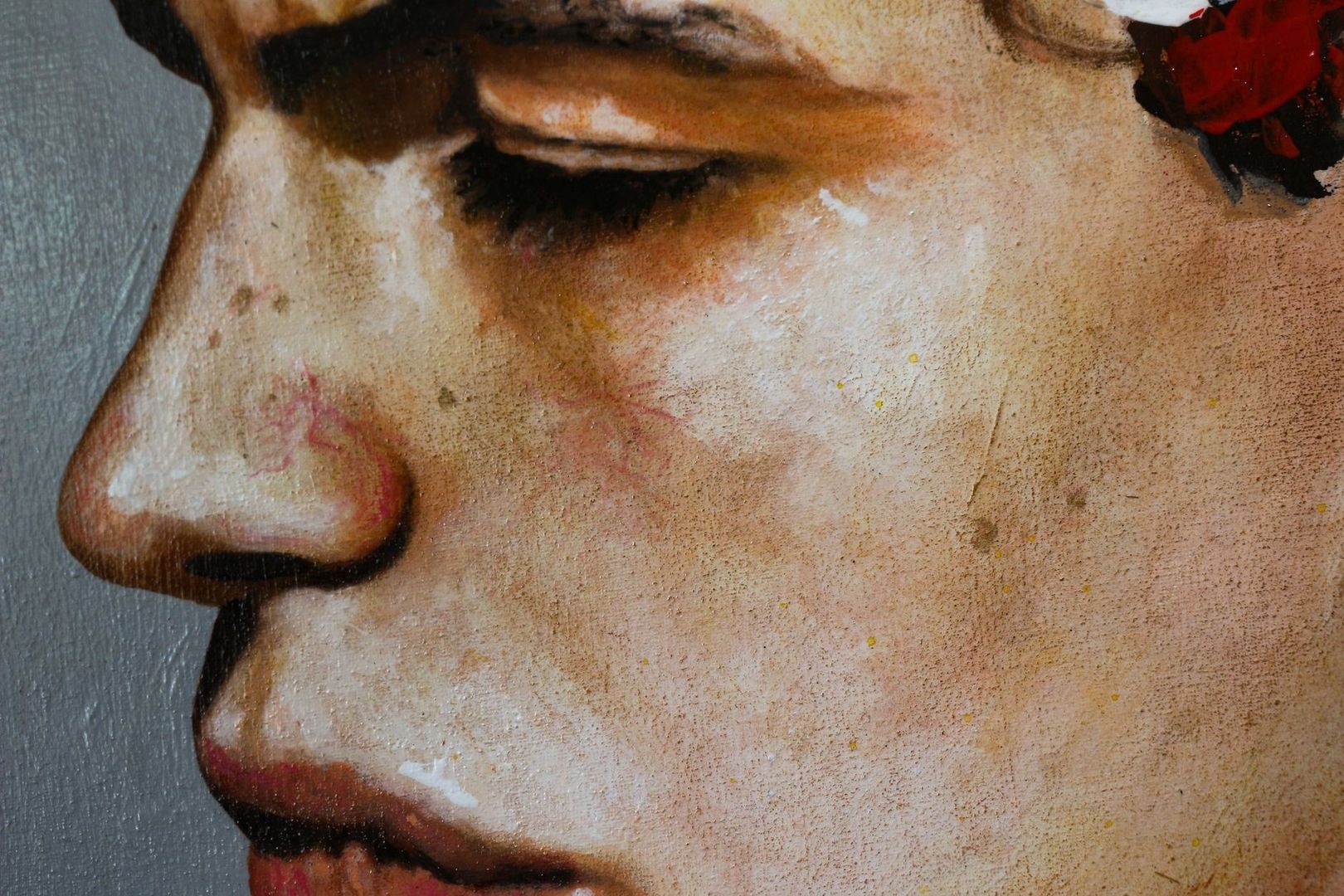
The distinction between chiaroscuro and tenebrism is subtle but valuable. Chiaroscuro, from the Italian words for light and dark, traditionally relies on graduated transitions. Leonardo da Vinci”s sfumato offers a refined example, with thin layers and softened edges allowing one tone to dissolve into another. In works such as the Mona Lisa, the face seems to emerge through atmospheric moisture rather than sit beneath a hard spotlight. Form is revealed patiently, and the viewer is invited to linger over transitions that suggest flesh, air, and distance.
Tenebrism pushes that logic toward confrontation. Associated especially with Caravaggio and the Baroque, it allows large areas of the composition to fall into near-blackness while a concentrated source illuminates the decisive action. Forms within the darkness may remain wholly unarticulated, rather than being gently modelled. The effect is not simply greater realism. It is a change in the emotional contract between artwork and spectator. Instead of calmly surveying a complete world, the viewer encounters a partial world in which the visible has been selected with urgency.
| Approach | Lighting mechanics | Narrative effect | Emotional register |
|---|---|---|---|
| Graduated chiaroscuro | Layered transitions between light and shadow | Builds volume, atmosphere, and spatial continuity | Intimacy, calm, ambiguity |
| Sfumato | Smoky, softened edges with minimal tonal interruption | Dissolves boundaries and creates atmospheric depth | Mystery, tenderness, psychological complexity |
| Tenebrism | Focused illumination against extensive or complete darkness | Isolates a person, gesture, or symbolic event | Shock, threat, revelation, spiritual urgency |
These categories are not rigid boxes. A painting can combine gradual modelling with abrupt value breaks, just as a film can use a soft falloff around a face while keeping the surrounding room nearly black. The distinction is most useful as a perceptual guide. Ask whether the shadow remains available for inspection or whether it functions as an obstruction. Chiaroscuro preserves a visual route through darkness; tenebrism closes much of that route and makes the illuminated area carry the narrative burden.
Caravaggio”s directional light often feels as though it enters from a high cellar window, an unseen doorway, or a narrow opening just outside the frame. It does not spread evenly through an imagined room. Instead, it strikes selected faces, shoulders, hands, and objects, converting a religious episode into a physical event. In The Calling of Saint Matthew, the beam turns an ordinary interior into a site of spiritual interruption. The figures retain the density of people caught in a working room, with rough clothing, weighty bodies, and gestures that appear to continue beyond the canvas.
This grounding in bodily reality is central to the emotional force. Caravaggio”s sacred figures do not float in a decorative atmosphere. They occupy compressed space, and their illuminated flesh seems close enough to touch. Stark value steps remove the comfortable distance associated with distant observation. The spectator is not shown a complete stage set with every object accounted for. Instead, the eye must enter the dark, locate the bodies, and reconstruct the surrounding space from fragments. The result is an active form of looking, charged by the possibility that something important remains just outside visibility.
Several spatial devices help create this pressure:
For a contemporary artist or photographer, the lesson is not to imitate a particular palette. It is to decide where the viewer should stand. A single window, a narrow softbox, or a sharply controlled practical light can produce a similarly directional effect when the surrounding illumination is restrained. The essential question is which physical detail deserves to carry the emotional event, and which parts of the scene should remain withheld.
Artemisia Gentileschi takes the force of tenebrism and redirects it toward determination. In her paintings, extreme shadow does not merely stage violence or announce divine intervention. It creates an interior chamber in which willpower becomes visible through posture, grip, resistance, and sustained effort. The darkness surrounding her figures can feel less like a void than a pressure field. It closes around the protagonists while giving their actions an intense, self-contained authority.
In Judith Slaying Holofernes, focused illumination makes fabric, blood, skin, and strain materially legible. The pale sleeve, heavy blue drapery, and exposed flesh are not decorative accents. Each surface records force. The beam catches the muscular tension in Judith”s arms, the maidservant”s commitment to the task, and the resistance of Holofernes”s body. Softer falloff prevents every edge from becoming equally hard, allowing certain forms to advance while others recede into a dense, intimate atmosphere.
The composition”s emotional architecture depends on how closely the figures are bound together:
Gentileschi”s achievement lies in making emotional autonomy spatial. Her figures do not simply express courage through facial expression. The lighting gives their resolve a physical territory. For contemporary visual work, this suggests a careful approach to depicting agency: illuminate the points where intention becomes action, and let surrounding darkness protect the scene from distraction. When every detail is equally exposed, determination can lose its structure. Selective visibility gives it form.
Human vision is highly responsive to boundaries. Sharp tonal transitions provide strong signals about edges, separation, and figure-ground relationships, while moderate transitions encourage the eye to integrate adjacent areas into a continuous field. This does not mean that high contrast is always more pleasing. A study in Frontiers in Psychology, involving digitized paintings and 55 participants, found a useful distinction: moderate contrast received the highest appreciation ratings, while highly increased contrast produced better recognition memory.
That separation between liking and remembering helps explain the persistent power of Baroque lighting. A very high-contrast image may not feel restful or conventionally beautiful, but it leaves a stronger perceptual trace. The brightest area and deepest dark establish a hierarchy that can be recalled after smaller details have faded. For narrative images, this is particularly effective. The viewer may remember the illuminated hand, the turned face, or the blade before remembering the architecture around it.
The eye often navigates such an image in a sequence like this:
This sequence is practical as well as scientific. When developing a painting, storyboard, portrait, or interior scheme, reduce the image to a few broad values before refining texture. If the eye cannot identify the principal light-dark relationship at a glance, additional detail will rarely solve the compositional problem. Contrast should be treated as a route through the image, not simply as a measure of dramatic intensity.
Modern painting, cinematography, photography, and interior design can all borrow the Baroque understanding of darkness as material. The key is edge control. A hard edge can make a form confront the viewer, while a soft edge allows it to recede or breathe. A deep dark can create a wall of visual mass, while a lifted shadow can preserve spatial continuity. These decisions govern proximity more reliably than decoration alone. In a living room, for example, a concealed lamp that grazes one textured wall may create more depth than several evenly distributed fixtures. In film, allowing a background to disappear can place the audience emotionally closer to a character”s face.
Begin with a clear hierarchy of tonal weight. Decide what must be seen first, what should reward a second look, and what can remain unknown. Keep the brightest values purposeful, protect the deepest darks from unnecessary contamination, and use reflected light sparingly so that shadow retains its authority. Whether working with paint, digital compositing, a camera, or a room, remember that negative space is not empty absence. It is an architectural mass that can conceal, compress, shelter, or threaten.
The most compelling contemporary use of chiaroscuro is therefore deliberate rather than merely dramatic. Shape the beam, measure the falloff, and test the image from the viewer”s expected distance. If the light reveals everything, introduce a boundary. If the darkness becomes inert, give it a small reflected cue or a directional relationship to the subject. With that balance, shadow becomes more than atmosphere. It becomes the quiet structure that tells the eye where to stand and the emotions where to gather.