Imagine standing before Mark Rothko’s Orange, Red, Yellow. You’re enveloped in vast fields of vibrant color. Do you feel a sense of warmth, energy, perhaps even a touch of unease? This isn’t accidental. In modern art, color transcends mere aesthetics; it’s a potent, carefully chosen language used by artists to evoke emotions, convey messages, and create profound experiences. This article delves into the psychology behind color choices, revealing how artists wield this powerful tool.
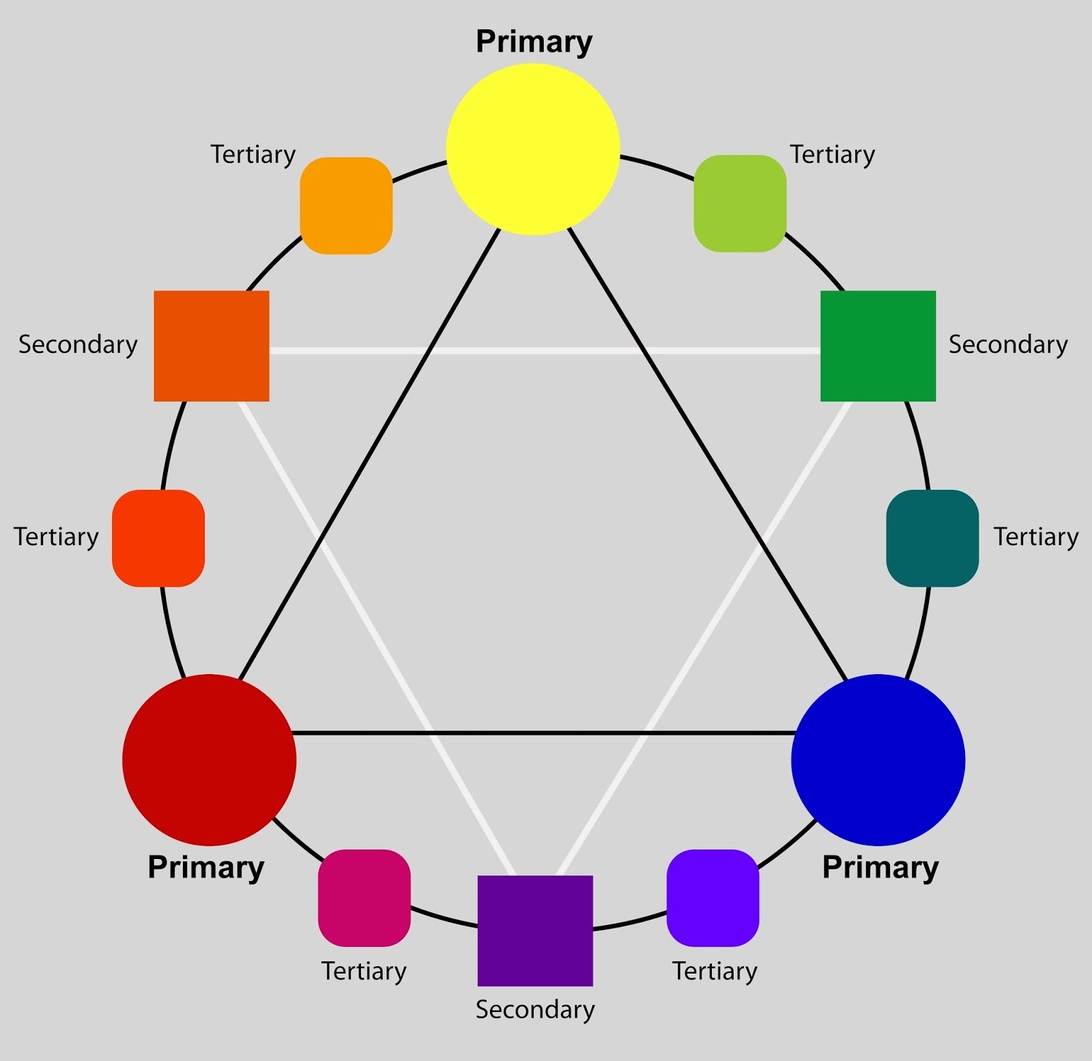
To grasp the deliberate color choices in modern art, a foundation in color theory is helpful. This theory, spanning from Isaac Newton’s color circle to Johann Wolfgang von Goethe’s psychologically focused studies, offers a framework for color organization and its impact. The color wheel, with its primary, secondary, and tertiary colors, shows relationships between hues. However, Goethe’s emphasis on the subjective, emotional impact of color truly unlocks a deeper understanding. He believed colors arise from light and darkness interactions, focusing on how we perceive color, not just light’s composition. This inspired artists to see color as a means of communicating emotions and moods, not merely a visual element.
Color harmony, a core concept, is about creating visually pleasing and balanced color combinations. Harmonious colors foster a sense of order and engagement. Artists use schemes like analogous colors (close on the color wheel) for tranquility, or complementary colors (opposites) for dynamism and tension. For instance, the Impressionists, inspired by new theories, used complementary colors to capture the vibrancy of light. They realized shadows weren’t just darker versions of a color, but could be created with complements, opening up new possibilities for depicting light and atmosphere.
Each color carries associations and can evoke different emotions. Red can signal passion and love, or aggression and danger. Blue is often linked to calm and peace, yet can also express melancholy. Artists consciously select colors to create specific moods. Vincent van Gogh, for example, used yellow intensely. His sunflowers convey both life’s vibrant energy and the intensity of his own emotions. Green, strongly associated with nature, often brings a sense of calm and balance. Think of Claude Monet’s garden paintings, where various shades of green are used to evoke peace and a connection with the natural world.
The division into warm (red, orange, yellow) and cool (blue, green, purple) colors is fundamental. Warm colors are often perceived as energetic and stimulating, while cool colors are associated with calm and peace. This division helps artists create specific atmospheres. However, it’s not universal. Cultural and individual experiences significantly shape color perception. While warm/cool concepts are similar in American and Japanese cultures, the value assigned to certain color ranges differs.
Colors carry symbolic meanings, varying significantly across cultures. While white often symbolizes purity in Western cultures, it can represent mourning elsewhere. In China, red is associated with good luck and prosperity, whereas in some African cultures, it can be a color of mourning. Understanding these variations is crucial when interpreting modern art, especially works drawing from diverse traditions. Artists may reinforce these meanings or challenge preconceived notions.
Beyond aesthetics, color is a powerful narrative tool. Artists use color symbolism and emotional associations to tell stories and convey ideas. A vibrant red might draw attention to a key element, symbolizing passion, while muted blues create a calming background. In Edvard Munch’s The Scream, the swirling, intense reds and oranges in the sky amplify the figure’s anguish, conveying a sense of overwhelming anxiety.
Modern art often freed color from its representational role. Impressionists explored color’s ability to capture light, while Expressionists used it to express intense emotions. Abstract artists like Wassily Kandinsky and Mark Rothko explored color’s intrinsic value, communicating directly with emotions, unbound by representation. Kandinsky theorized a direct correlation between colors and emotions, making color the subject itself.
Color Field Painting, a form of abstract art, emphasizes color’s expressive power. Artists like Mark Rothko created large canvases with intense color fields, aiming for a direct emotional response. Color Field Painting involves applying large areas of a single color to the canvas. Rothko’s works, with saturated colors, invite contemplation. His Seagram Murals, intended for the Four Seasons restaurant, aimed to express basic human emotions like tragedy and ecstasy, creating an immersive environment.
Beyond individual colors, combinations create unique effects. Complementary colors (e.g., red and green) create vibrant contrast, generating excitement. Analogous colors (e.g., blue, blue-green, green) create harmony and calmness. Artists carefully consider these combinations. The interplay between colors is as crucial as the hues themselves. For example, Josef Albers, in his Homage to the Square series, extensively explored how the perception of a single color changes depending on the colors surrounding it, demonstrating the relativity of color perception.
Contemporary artists continue exploring color’s psychological potential. Digital art and installations offer new ways to use color and light. Artists challenge traditional theories, exploring individual and cultural associations. Color remains central, its psychological impact a constant. Olafur Eliasson uses monochrome light to alter perception and create shared emotional atmospheres. The principles of color psychology extend beyond art, influencing fields like marketing and design. The color of a product, a website, or a room can significantly impact our mood and behavior, demonstrating the broad relevance of understanding color’s impact.
Despite centuries of study, color’s psychological impact remains complex. Subjectivity, cultural variations, and individual experiences make a universal theory challenging. Yet, this complexity makes color a powerful artistic tool. Color’s ability to touch us deeply, evoke emotions, and communicate beyond words ensures its enduring power in art, offering endless inspiration.